ReportBase - Charts for Monitoring Data
|
The system provides many different chart types to visualize monitoring data (nagios performance data in CustoSec), which can be chosen from during the template creation. Besides the chart type additional settings can be set to adapt the charts final look: Values to be presented in the chart:
Settings for the Charts:
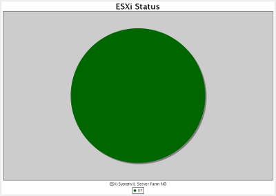
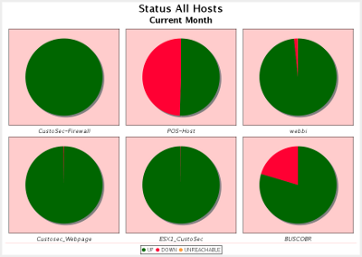
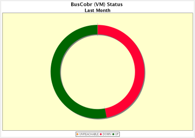
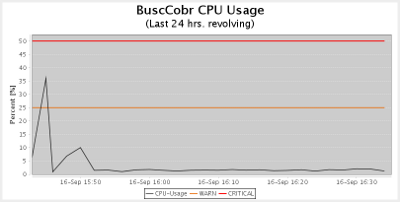
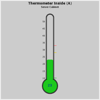
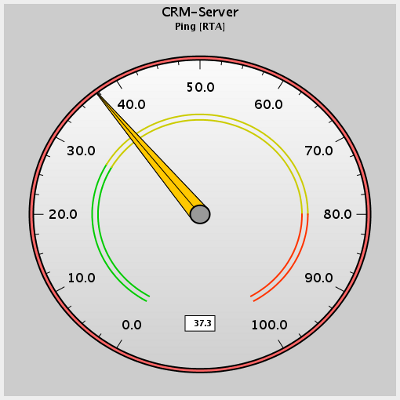
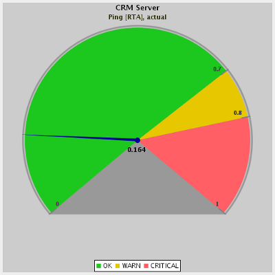
There are different types of charts available for different type of monitoring data: Charts for single or multiple hostsTo visualize the status of a host status (up, down, unreachable), usually a pie chart is used. There are three variants of a pie chart available: Single Pie ChartTo present the status (actual or time range) of one or multiple hosts in one chart. Ring ChartLike the pie, to visualize the status (actual or time range) of one or multiple hosts in one chart. Multi-Pie ChartTo visualize multiple hosts (actual or time range) individually in one chart. Charts for service checksThere are different chart types that are useful for different types of service checks Pie and Ring ChartsLike on hosts, these types are available for service checks as well and useful to present status data of a service (ok, warn, critical) Time chartsThis chart is well suited for service checks that return numerical values. They are presented on a time line. Examples: checks for temperature, hdd usage, cpu usage, etc. Warn and Critical - Values can be extracted from the check itself or entered as fixed values within the chart. Thermometer ChartAnother chart type for displaying numeric values is the thermometer chart. Colours, outline etc. can be adapted individually. Dial ChartThe dial chart display the actual value and can additionally show 3 ranges indicating ok, warn or critical. Meter ChartAnother chart type to present values of a check. Again, one value is shown and a colour coding can be defined to indicate the ok, warn, critical ranges.
All these charts can be customized individually with colours, labels, outline, etc. (More information on this can be found in the ReportBase Online Documentation). If defined so, the charts will be updated regularly (revolving reports). Each single chart can be part of one or many different cockpits or dashboards as defined in ReportBase Cockpits (see link). Or they can be downloaded from or incorporated into any other external application by a http-link. |
|


